The Tequila-Printed Tee That Looks Intentional (Not Like You Raided Your Teenager's Closet)
The right graphic lifts your face. Muted colors, vintage typography, and a flattering cut turn a simple printed tee into weekend armor.
- Vintage-toned graphics (faded greens and yellows) read more intentional than neons
- Center placement means your face is the focal point, not body width
- One statement tee + color-matched accessories + neutral bottoms = effortless polishing
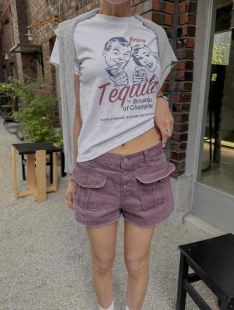
There's a specific moment in middle age when bold graphic tees stop reading as "cool" and start reading as "trying." So you retreat to solids. Boring works, but it also feels like giving up. The answer isn't avoiding print altogether—it's choosing the right print.
This tequila lettering uses faded greens and warm yellows instead of neon brights. It's vintage-looking in the way that implies you have taste and maybe a story about where you got it. The letters sit centered on the chest, which means your eye naturally lands there—not on your shoulders, not on the width of your torso. A graphic placed anywhere else might betray the parts you're trying to hide. This one works because it's a natural focal point anyway.
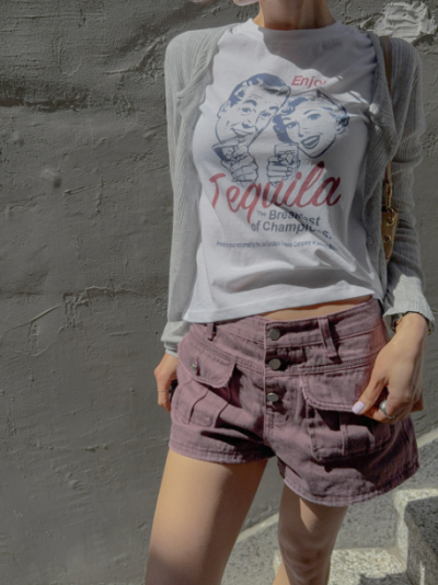
The cut is standard relaxed fit: not tight enough to show every contour, not loose enough to look like you're drowning. Your shoulders drop naturally, the sleeves hit right around the thickest part of your upper arm and fall loose from there. You can move, you can breathe, and you don't spend the day conscious of how the fabric is hugging your middle. That psychological freedom is half of comfort.
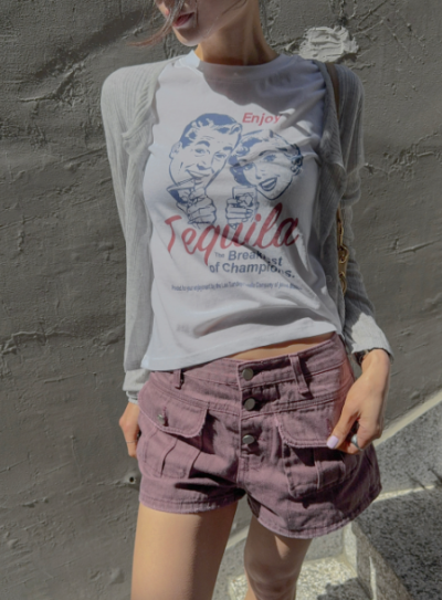
Here's where the actual styling magic happens. Pull a forest-green baseball cap down low—match it exactly to one of the colors in the tee. Suddenly the whole outfit has intentionality. It reads coordinated without looking like you spent two hours planning. Add a bright red mini bag as contrast, and now you've got something. Complementary colors catch the eye, but when they're balanced (one warm, one cool, both muted enough not to scream), they feel sophisticated instead of chaotic.
Pair it with light-wash jeans and white sneakers for easy casualness. Swap the jeans for a beige linen skirt and suddenly you're brunch-ready, the kind of person who looks effortless because you're not trying too hard to look good. Throw it over a slip dress. The tee becomes a layer, adds texture, suddenly that simple dress becomes a whole outfit. That versatility is what makes something worth wearing all summer instead of storing away in April.
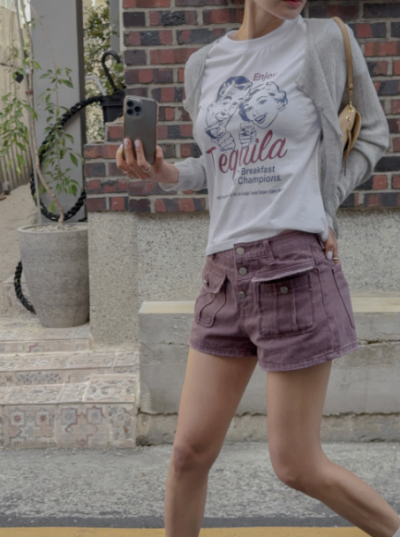
The real thing about graphic tees at this stage is permission. Permission to be playful. Permission to not dress like you're going to a boardroom or a funeral. Permission to look like you have a personality and opinions. This one gives you that while keeping you grounded in colors and proportions that actually flatter.
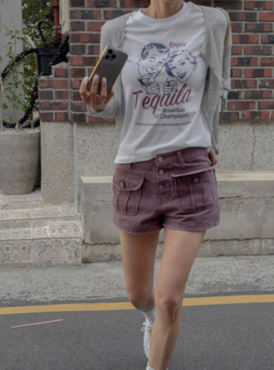
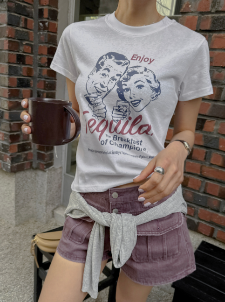

"The graphic is placed where your eye naturally lands anyway. A graphic placed anywhere else might betray the parts you're trying to hide. This one works because it's a natural focal point."