
Blue Floral That Reads Mediterranean Chic, Not Small-Town Garden Party
The color of the pattern and the base fabric matter more than the print itself. White-and-blue beats bright-and-busy every single time.
- White-based prints with clear, cobalt patterns read chic instead of grandmotherly
- Deep V-neckline moves the focal point to your face and away from arm width
- Lightweight fabric that doesn't cling or show sweat is non-negotiable for summer
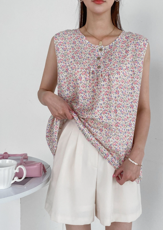
Florals stop reading young the moment the colors get too busy or the base too dark. But abandoning flowers entirely means losing something that works. The answer? Choosing florals that read as intentional rather than default.
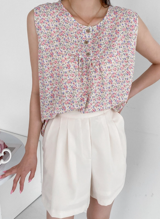
This particular blue-on-white print uses large blooms in a clean cobalt tone against a pristine white base. There's breathing room. The white background means your face isn't surrounded by visual noise—it's surrounded by clarity. That clarity bounces light back to your skin. It's the same reason fashion photographers use white reflector panels, and it's why this color combination makes anyone look five years fresher.
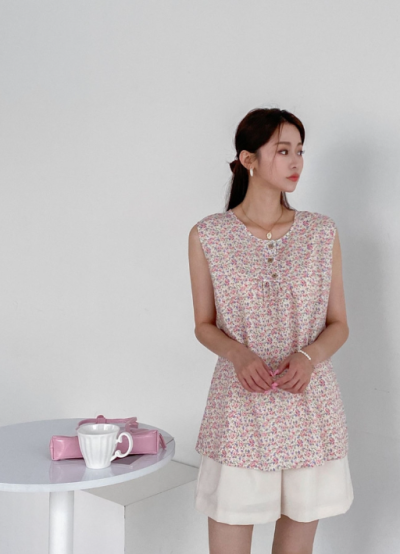
The neckline is the second key detail. A deep V-neck draws the eye downward and inward toward your face, away from your shoulders and upper back. Your collarbones, your jawline, your cheekbones become the focal points. At the same time, the V is never so deep that you're exposing anything inappropriate or spilling into uncomfortable territory. It's sophisticated cleavage, the kind that reads as intentional rather than accidental.
The fabric is a lightweight linen-cotton blend that feels almost nothing against your skin. When you're hot, it doesn't cling. When you sweat, it doesn't show it or feel heavy. That's non-negotiable in summer wear. Thread count matters, weave matters, fiber content matters—but the real test is whether you forget you're wearing it. This one passes.
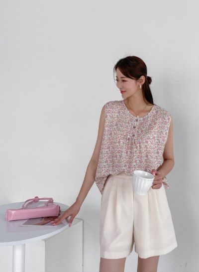
The silhouette is A-line from chest to hem, which means it skims your body without emphasizing your stomach or hips. The cut is loose enough to be forgiving but structured enough to read intentional. Single buttons run down the front, creating a vertical line that visually narrows your overall shape. It's a trick, but it's an honest one—buttons naturally draw the eye down, so a vertical button line makes you read as taller and leaner.
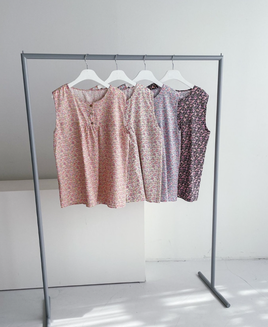
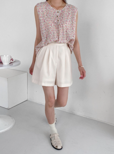
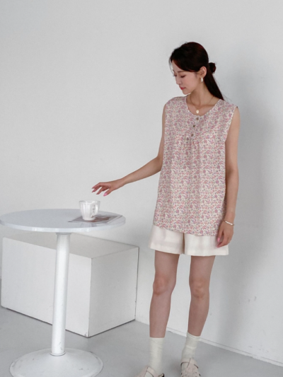
Here's where styling choices determine whether you look like you just threw it on or you're actually dressed. Pair it with bright white linen pants or cream-colored pants and suddenly you're reading as elegant. Add a pair of simple flat sandals and you're resort-ready. There's a reason this color combination reads as Mediterranean chic—it's actually the color palette of Mediterranean life. The regions where people dress the best and age most gracefully tend toward blue-and-white in summer, and for good reason.
For everyday wear, try it over pale blue jeans with simple sandals. The blue in the print echoes the blue in the jeans without matching exactly, which reads as thoughtful instead of accidental. You're not trying too hard, but you're clearly trying. That balance is what mature dressing actually is.

"That clarity bounces light back to your skin. It's the same reason fashion photographers use white reflector panels, and it's why this color combination makes anyone look five years fresher."