From 66kg to Runway-Ready: Lee Su-kyung's Color-Bold, Balance-Smart Edit
The actress who lost 20kg is teaching us that bright colors need sheer fabrics and oversized cuts—not timidity—to actually work.
- Sheer fabrics turn bright colors from risky to editorial
- Unexpected color pairs work when you oversized the fit and lighten the tone
- A single detail button on neutral pieces elevates without screaming
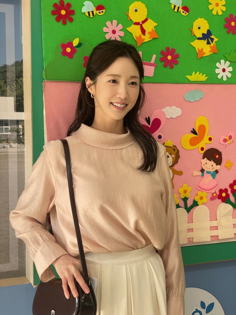
She used to be 66 kilograms. Then she lost 20. The whole journey became this whole thing, diet product ads and everything, and suddenly her whole image shifted into this refined urban-woman aesthetic. That discipline rewired how she moves through the world.
Lee Su-kyung started in the 2000s doing commercial work, then made her film debut in 2006 with Tazza—she was the lead's lover, and people sat up and took notice. After that came a run of stuff: from melodramas to comedy to prestige projects. Her voice is this bright, high-toned thing that's entirely her own. The point is, she's spent years building this vocabulary of restraint and sharpness.
But here's where it gets interesting—she's not actually afraid of color. She's just smart about how to use it:
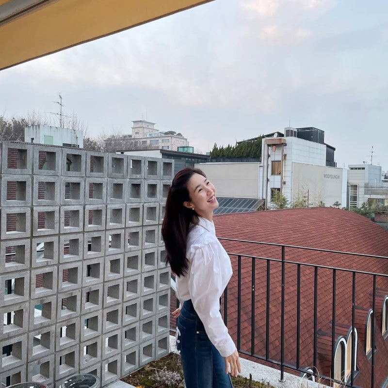
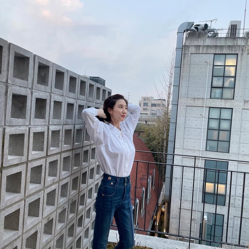
Start with the simple one: white frilly blouse over deep indigo denim. The frills are on the neck and sleeves, so you get femininity in a restrained dose. Dark denim grounds it. But then notice the detail—the denim has a little floral button accent at the waist. That one small touch stops the whole thing from reading as basic. Same black-and-white formula millions of people wear, but that button rescue operation transforms it. Against a concrete rooftop? Everything reads more urban, more polished, more you-could-wear-this-anywhere.
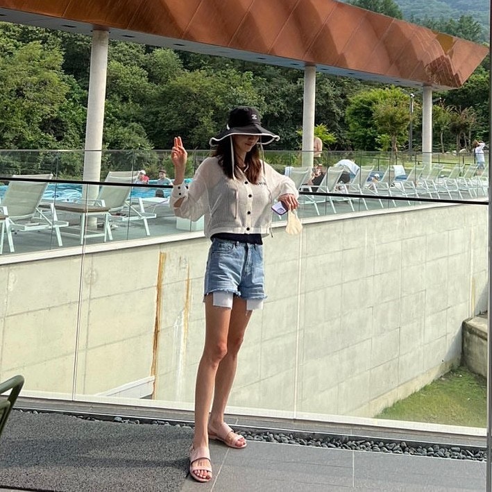
Then there's the travel moment: brown graphic short-sleeve tee with pink cargo pants. On the surface, this breaks the rules people usually follow. Brown and pink together sounds impossible, right? But it works because she's letting both colors breathe. Oversized fit on the graphic tee, real structured fabric on the cargo, and then she's pulled the visual weight down with a white lace bucket hat and white flip-flops. The palette stays light despite the warm colors, so it reads summery instead of heavy. Shot on location like a film set, which is probably exactly what it was, and the whole thing carries that effortless, on-set-between-takes energy.
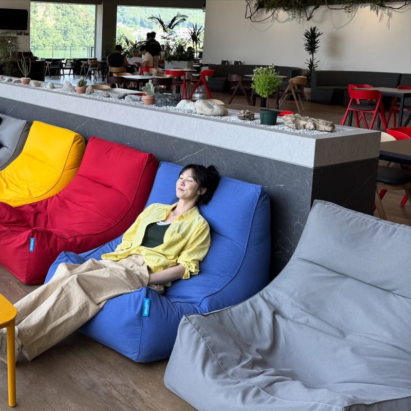
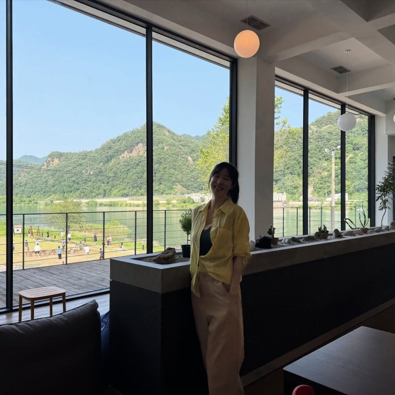
The statement piece, though: pale yellow see-through shirt with a green liner underneath, beige wide-leg pants. Yellow and green—this is genuinely bold. But because the yellow is sheer, the colors float instead of hitting you like a brick. She's letting the shirt drape instead of tucking it, so there's volume and ease. Strong Vibe cafe setting, and the whole thing reads as editorial. She literally proved right there that bright colors stop being scary the second you add transparency and let the fit relax. You could be intimidated by wearing that yellow by itself. But translucent? Game changer.

Here's her design principle: when you're keeping things simple—white blouse, dark denim—that's when you add a detail button. When you want to experiment with color, you pick unexpected combinations and then neutralize them with oversized fit and pale undertones. And when you're really going for it, sheer fabrics let you scale up both the boldness and the polish at exactly the same time. She's proving that the people who look like they don't try? They're actually trying in invisible ways. Sheer here. Translucent there. One clever button. That's the whole language right there.
"Sheer fabrics let you scale up both the boldness and the polish at exactly the same time."