Moon Chae-Won Always Tops the 'Best in Hanbok' Polls — Now Watch Her Master Regular Clothes Too
At 168cm with that clear, serene vibe that needs almost no makeup, she makes basic items into editorial moments through pure color theory.
- Moon Chae-won works through tonal clarity: white-to-cream tones for summer, gray-denim ease for travel, and burgundy-blue contrast for casual walks.
- Her formula is pure color theory — each outfit nails one chromatic idea and adds almost nothing else.
- Minimal accessories, clean lines, and the confidence that the base outfit is enough — that's what makes casual into editorial.
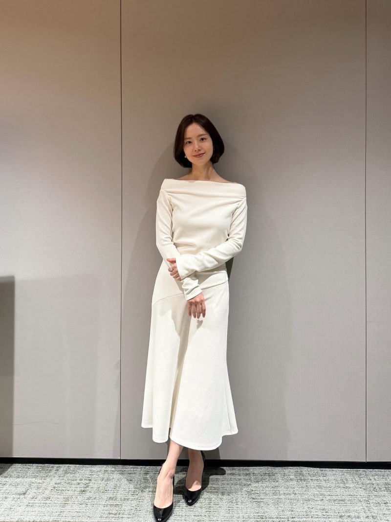
There's this actress who's basically locked down the 'most beautiful in traditional Korean dress' title forever. But here's the thing: she's equally comfortable in a Daegu alley or Tokyo street, and her everyday styling is actually more interesting than you'd expect from someone who could just coast on visuals alone. Moon Chae-won has been working since 2008 — we're talking 'Wind's Paintbrush,' then 'Boys Over Flowers'-level princess roles, then 'The Last Empress,' then drama after drama where she completely earns her place. She's got this inborn serenity that means she could wear literally anything and still look like she's in a film, but she's clearly thinking about it anyway.
**Summer Brightness: The White Ringer Tee Test**
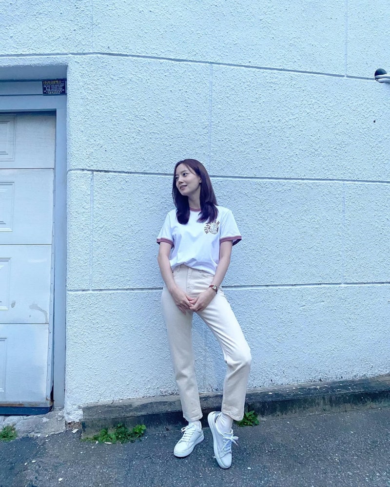
First outfit is set against a white alleyway wall, and it's almost aggressively simple. The top is a white ringer short-sleeve tee — you know, that classic split-collar style with the contrasting trim. There's this subtle pink tint to the collar and sleeve edges, and a tiny logo graphic on the front that keeps it from reading as *too* minimal. It's giving retro-casual without feeling dated.
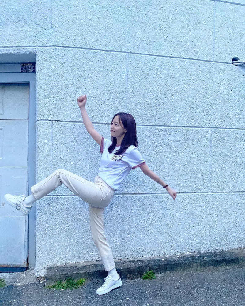
She paired it with ivory/cream straight-leg pants — so we're going full tone-on-tone from white to cream, which in the summer heat is basically the whole move. White sneakers all the way down on the feet. Then one brown leather strap watch for the only warm accent. Everything else is bright, bright, bright. The whole palette is designed to read as fresh and cool, and it works because it's *completely* committed. There's no mixed metals, no competing colors, just this super clean tonal harmony. The poses in these shots — leaning against walls, casual leg-ups — add this youthful playfulness that the minimal palette might otherwise lose.
**Casual with an Edge: Japan Trip Denim Bermudas**
Second look is from a Japan trip, and it's got a very different personality. Light gray heather tee on top — that soft gray that doesn't compete with anything and just kind of sits there being easy. Nothing fancy, no graphic, just texture.
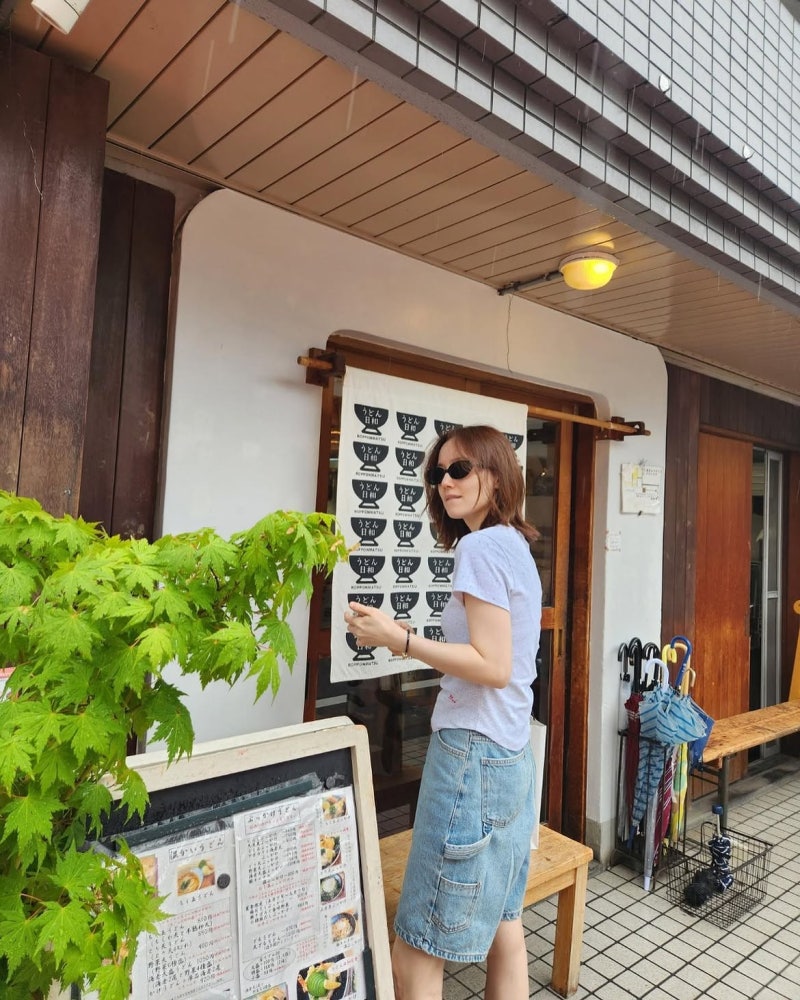
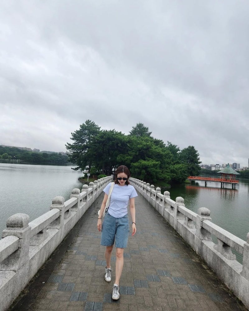
The moment comes in the bottom: knee-length light-wash denim bermuda shorts with cargo pocket details on the sides. That cargo element is the thing that prevents 'basic shorts' from being just... basic shorts. It adds a functional, contemporary feel. She added a black square sunglasses for that sharp accent, a white crossbody bag, and silver sneakers. Then the background is Tokyo — temples, streets, that whole vibe — and somehow the outfit reads as *more* vacation-ready and purposeful than if she'd grabbed something louder. Gray plus denim is a really classic palette, but the bermuda length and those cargo pockets make it feel 2026 rather than 2006. She's not trying to be loud; she's trying to be present and comfortable, and that's actually harder.
**Deep Tones For a Walk: The Burgundy Moment**
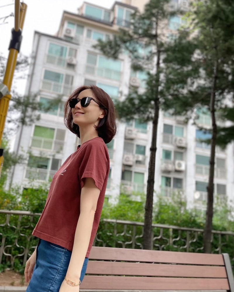
Third look is a neighborhood walk outfit, and the whole energy shifts to something more sophisticated. Burgundy short-sleeve tee with 'CLUB' lettering printed across the front — that deep wine color would normally read as formal or serious, but the vintage-looking font and faded quality of the print keep it casual and nostalgic.
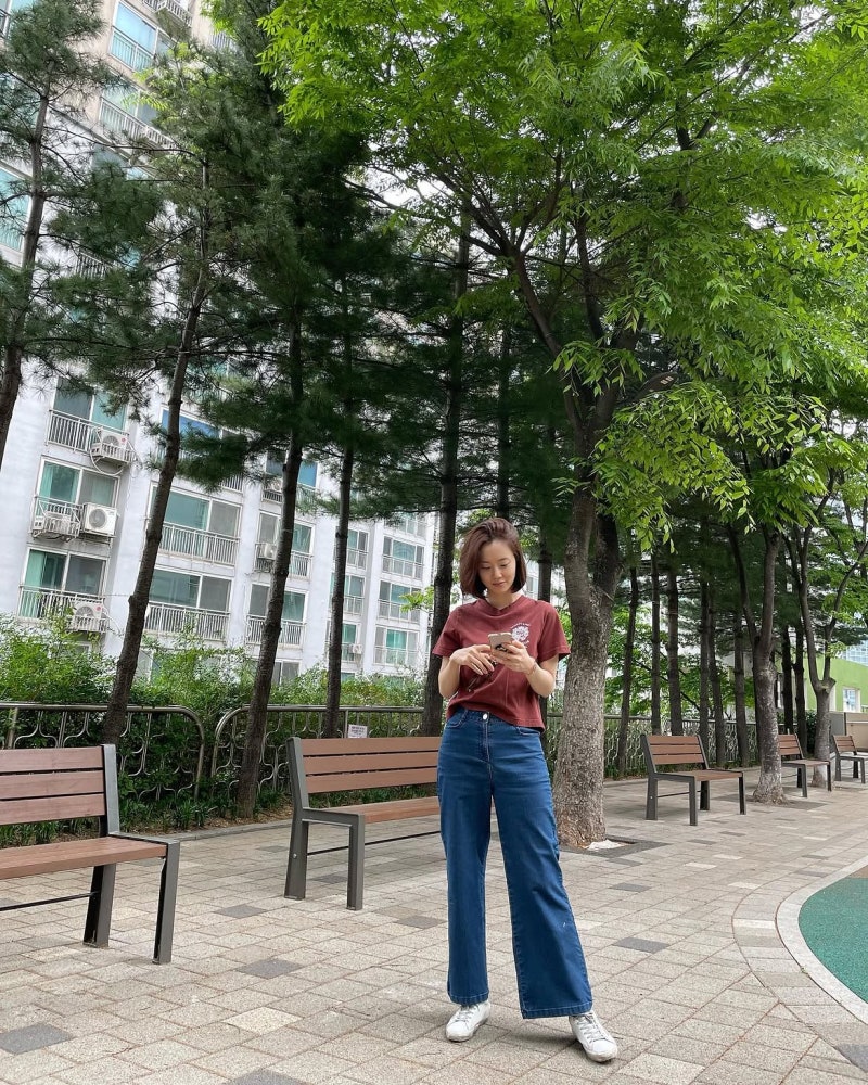
She paired it with a medium-blue wide-leg denim pant, which is great color contrast — burgundy and denim blue are different enough to be interesting but not so clashing that it feels wrong. The denim hem just opens wide and easy, which makes it feel comfortable even on a daily walk. Black sunglasses, gold bangles, white sneakers. The burgundy-denim combo is quietly sophisticated; it's not neon, it's not pastels, it's just... good taste. Somehow a neighborhood walk in a residential complex looks more considered than it probably took 30 seconds to throw together.
**Why Her Approach Actually Works**
Moon Chae-won's whole styling philosophy is 'nail the color blocking, then stop.' She's not piling accessories; she's not mixing seven competing textures. First look is tonal brightness, second look is functional ease, third look is complementary colors with nothing extra. The accessories aren't replacing the outfit; they're barely happening. She'll add a watch, a belt, some sunglasses, but nothing is screaming. What makes this sophisticated is the restraint — she trusts that her proportions and her presence don't need backup. She knows that tone-on-tone white in summer hits different, that gray-plus-denim is never wrong, and that color blocking in complementary shades just works. Anyone can copy this formula.
"The whole palette is designed to read as fresh and cool, and it works because it's completely committed. There's no mixed metals, no competing colors, just this super clean tonal harmony."