
Real People Gasp at Her Proportions Before They Notice Her Face: Winter's Slim Frame Decoder
Winter proves that slim, delicate frames aren't a liability—they're a design *opportunity*. Here's how she maximizes an angular silhouette with oversized pieces, smart layering, and fearless color.
- Winter treats her slim, angular frame as a design asset, not a limitation—oversized pieces become opportunities to create visual contrast and negative space.
- She consistently uses necklines that expose collarbones and shoulder lines, turning her sharpest features into the visual anchor for each outfit.
- Color and texture diversity (pastels, vintage details, bold patterns) work because her minimal body frame acts as a neutral canvas that lets those elements sing without competing for attention.
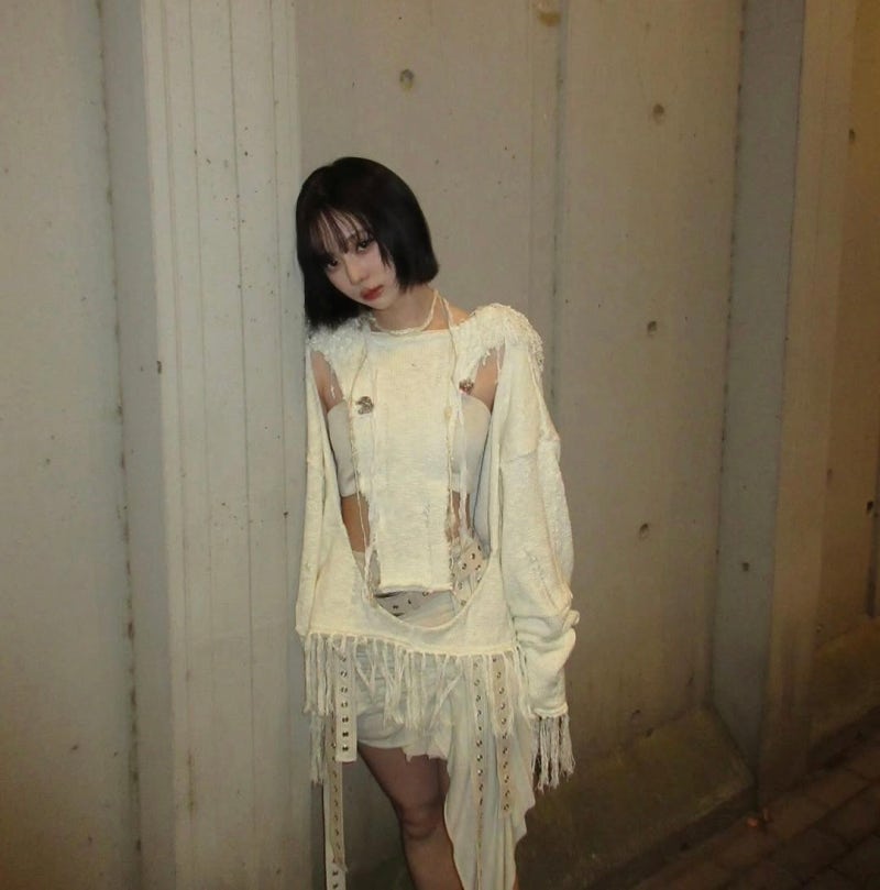
Winter walks differently than most people. When real-world fans meet her in person, they say it's not her face that lands first—it's her proportions. Sharp shoulders. Zero excess at the waist. An angular architecture that seems almost designed to wear clothes in an entirely different language than everyone else gets to speak.
She's been tapped as a global ambassador for Polo Ralph Lauren—not because of name recognition alone, but because she *solves* the brief. Casual meets refined. Classic meets trendy. On most people, that sentence is a cliché. On Winter, it's a solved equation.
Today we're breaking down six looks that show how she leverages a slim, sharp frame—not by hiding it, but by *designing around it*. This is masterclass in understanding your own architecture.
**Deconstructed Vintage: The Avantgarde White Moment**
First look—this is art-house territory.
A layered white top with deconstructed details (threads pulled loose, distressed textures) + a skirt with long fringe extensions. Her signature short hair catches light against the loose knit, and when the neckline opens wide, her collarbones *speak*. Those bones—that sharp line—is the real jewelry here. The outfit is giving intentional chaos, but her body stays the anchor. That contrast is what makes it work.
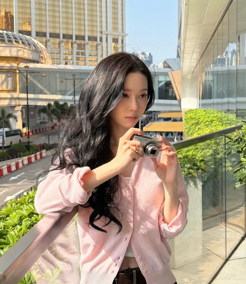
The outfit doesn't flatter so much as it *frames* her. When a piece is that deconstructed, a curvier frame gets swallowed. She wears it like a gallery installation she just happened to step into.
**Pastel Authority: Pink Cardigan as a Study in Subtle Power**
Second look sits in warmer territory—but the precision doesn't budge.
A pale strawberry-milk pink V-neck cardigan layered over white, gold ring accents on her fingers, and long wavy dark hair that catches light like it's been waiting all day to frame her face. She's not trying to be cute. She's solving an equation: pastels + size contrast (oversized cardigan + minimal body) + vintage-gold accents = effortless upper-class vibe.
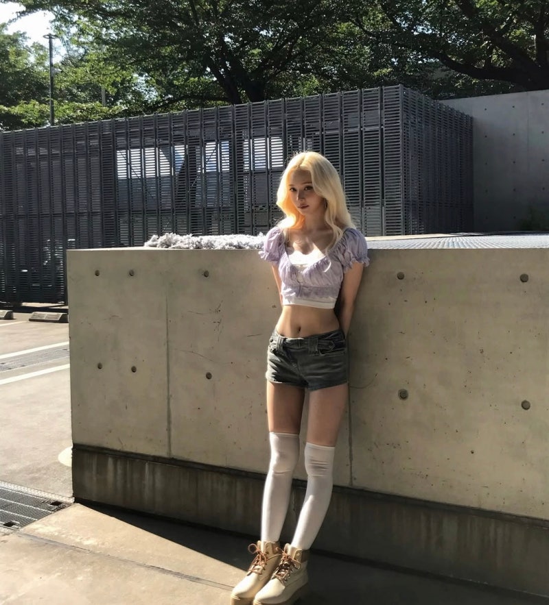
When you wear an oversized cardigan and you're slim, the trick is to *show the gap*. She rolls one sleeve up slightly, lets you see her wrist, her palm, her hands. That small exposure breaks the potential drowning effect. It's a master-level detail.
**Peak Proportion: The Y2K Barbie Equation**
Third look—this is where her body *becomes* the narrative.
Lavender-pink ruffle crop top + super-short denim shorts + white knee-high socks + platform boots. Blonde waves, makeup that sparkles. She's coded this as peak Y2K barbie energy, but what's actually happening is geometry. The exposed waist. The infinite leg line. The way the boots and socks create negative space. Her frame is the *grid* that makes everything else land.
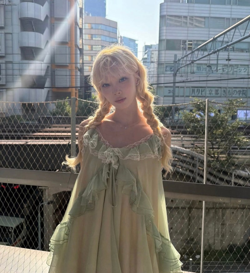
Longer, wider bodies can wear this look, but it reads different. On a fuller frame, it reads *costume*. On her? It reads like she was born in the year 2003, styled herself at a mall, and somehow became iconic doing it. She's not performing Y2K nostalgia—she's *channeling the spirit* of it through a body that has the architecture to *inhabit* it.
**Ethereal & Braided: Green Vintage Dress Territory**
Fourth look brings dreamlike narrative.
Two-braided blonde hair, an avocado-green sheer slip dress with tiered lace and sherring details. The sunlight hits the semi-transparent fabric, and her frame becomes almost translucent—like a figure from a fairy tale. She's not trying to be sexy; she's trying to be *ethereal*. The braids are the storytelling device. The dress is the forest she's walking through.
With this delicate frame and sheer fabrics, there's a temptation to look frail. She doesn't. She looks intentional. That's because her internal architecture (posture, that invisible core) is absolutely locked.
**Romantic Silkiness: The Pink Bustier Moment**
Fifth photo—satin-smooth sensuality.
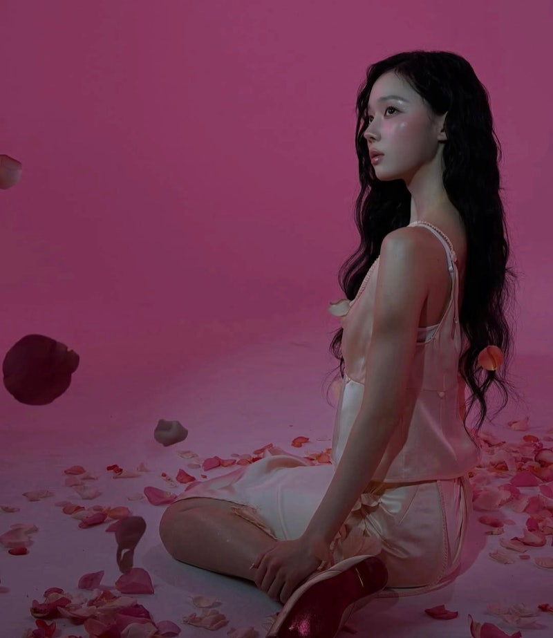
A pastel pink silk bustier + matching skirt (a set, basically), with Mary Jane-style shoes and rose petals scattered on the ground. Her hair is dark and wavy. Her makeup is soft pink. The entire frame reads as a romantic still life—but she's *not* looking vulnerable. She's looking knowing.
With slim frames, satin can feel like it's sliding off. She wears it like it's a second skin, like she and the fabric have made a pact about where it lives on her body. One-tone dressing on a slim frame = extended line. That's geometry.
**Natural Ease: Beige Oversized Cardigan as the Finale**
Last look: A rainy window, interior light, total ease.
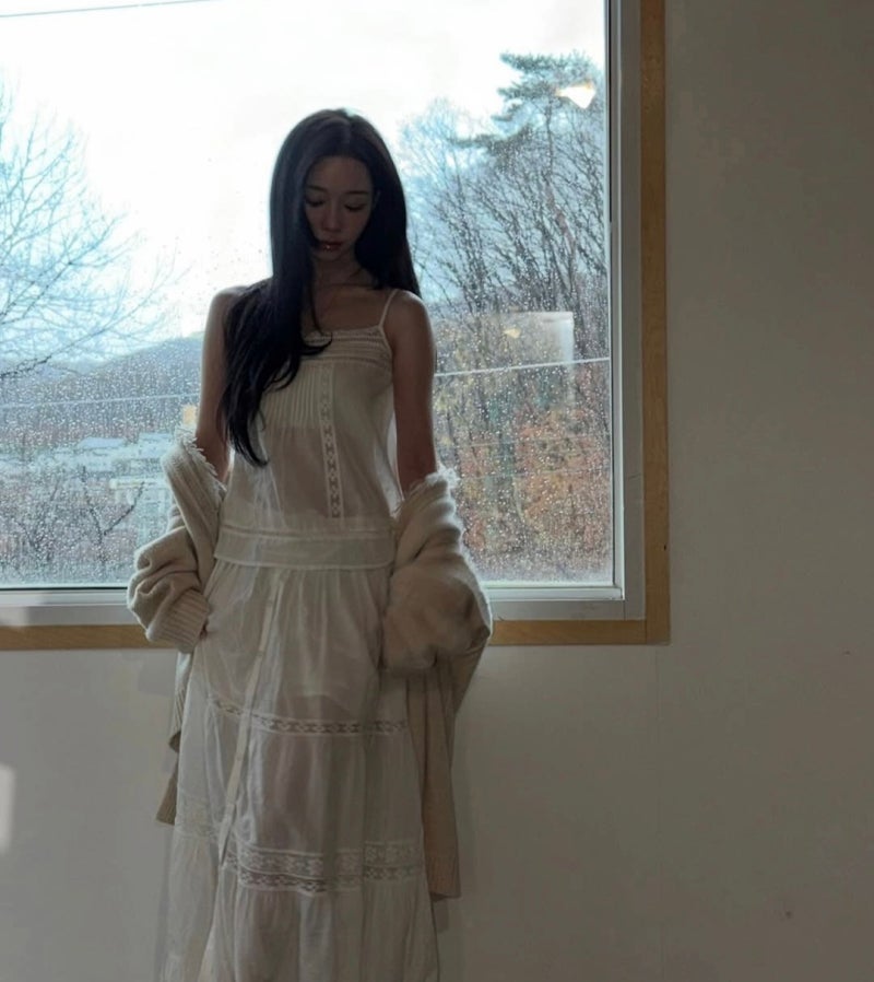
A cream-white bustier slip dress + an oversized beige cardigan draped casually off one shoulder. The off-shoulder angle shows her thin shoulder bone, her collarbone, creates visual negative space. She's sitting, relaxed, but her posture says she was *born* knowing how to wear clothes.
The cardigan could swallow her. Instead, she's using the oversized silhouette as a *design decision*, not a flaw. The way it falls, the gap between fabric and body, the exposed shoulder—these aren't accidents. They're the actual design brief.
**What Winter's Code Teaches**
If your frame is slim and angular:
**Oversized pieces aren't camouflage—they're *opportunity*.** The gap between your body and the fabric becomes the story. Design into the contradiction instead of fighting it.
**Necklines that open wide** (off-shoulder, wide V, dramatic cuts) aren't risky when your collarbones and shoulder line are sharp. They're *solutions*. They frame your best feature line.
**Color diversity** works on slim frames because there's less visual competition. Pastels, jewel tones, even bold prints—your body becomes the *neutral anchor* that lets color live.
**Layering is everything.** One piece can drown you. Two pieces, intentionally chosen for contrast, make an argument. That argument is what reads as *style*.
Winter isn't fighting her frame. She's *designing with* it. And that's the whole lesson.
"She's not performing Y2K nostalgia—she's channeling the spirit of it through a body that has the architecture to inhabit it."